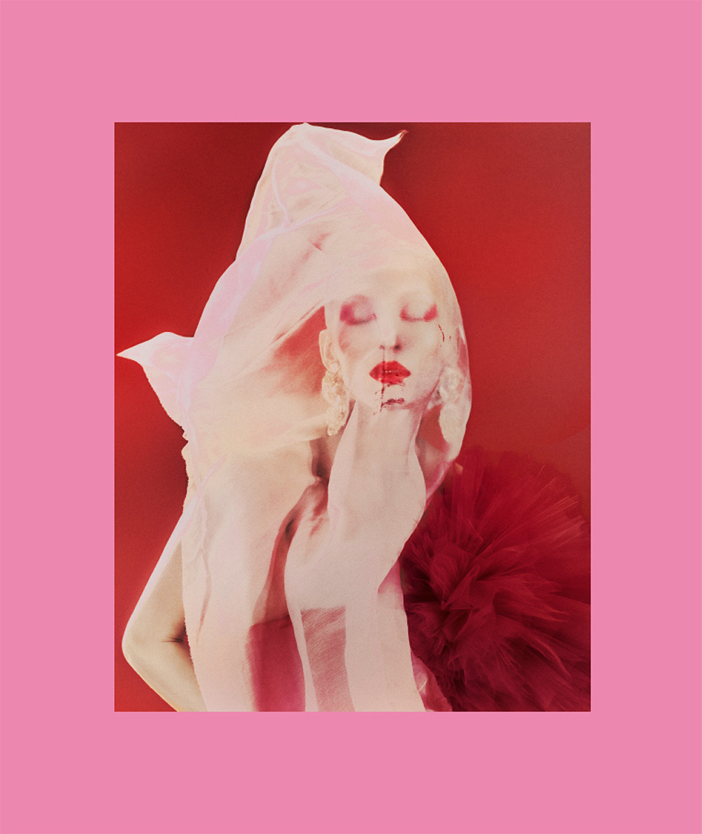
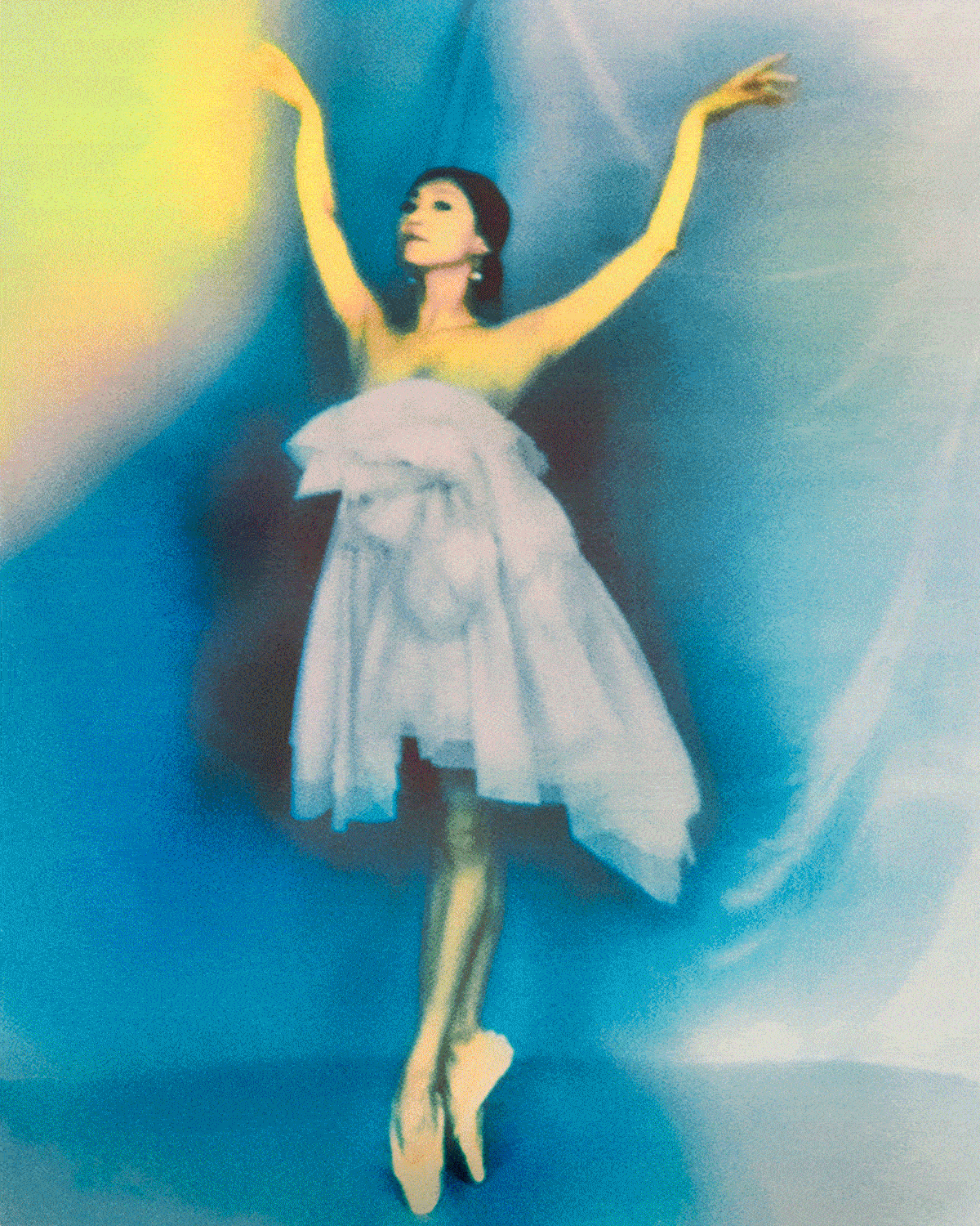
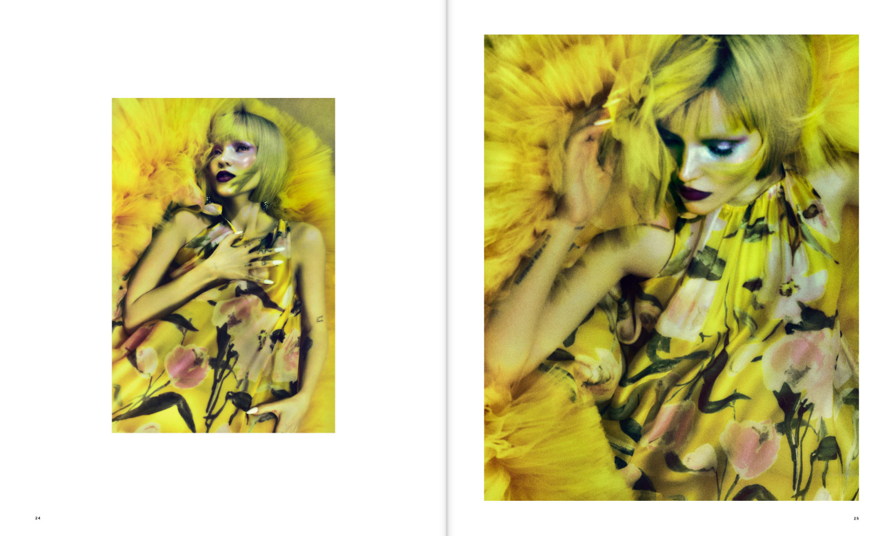
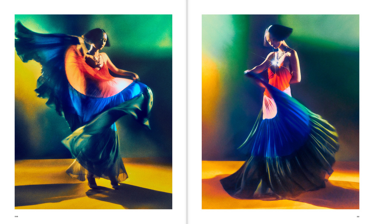
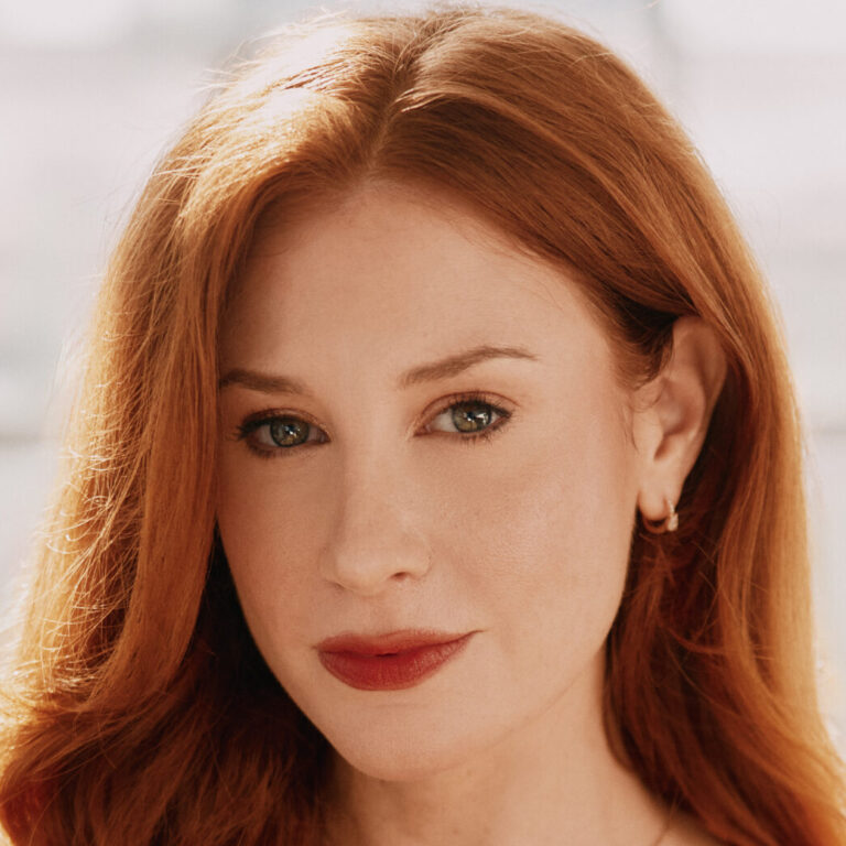
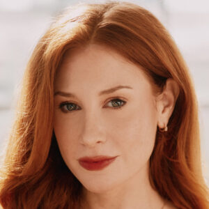
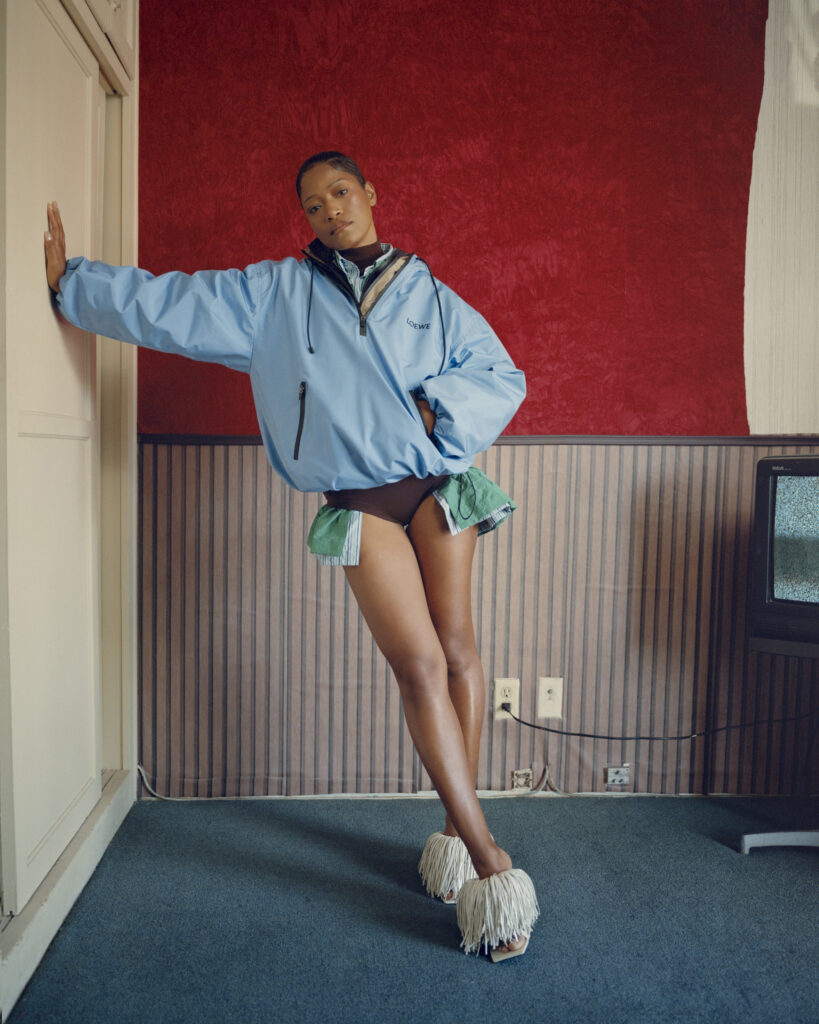
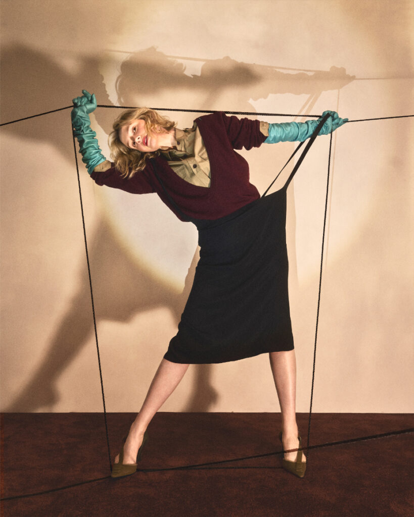
If there's one thing Carolina Herrera will never be, it is dull. Creative Director Wes Gordon, who has helmed the brand since 2018, takes the brand's commitment to color very seriously. Herrera's vibrant legacy is embodied in a new collaboration between Gordon and photographer Elizaveta Porodina, known for her painting-like imagery. Their Rizzoli book, COLORMANIA: Color and Fashion, serves as an ode to the Herrera woman: alive, dynamic, and unapologetically colorful. As Gordon puts it, “She’s in hot pink on a sidewalk full of people in gray.”
The publication is riddled with the fashion house's muses—think Dove Cameron, Wendy Whelan, and Maggie Maurer—and opens with a foreward penned by British Vogue’s editor-in-chief and Vogue European editorial director Edward Enninful. In a conversation with CULTURED, Gordon delved deep into his design process, the book's pandemic origins, and how he and Porodina have charted a new course for the Herrera house.
CULTURED: I want to talk about your relationship with bright colors. Did you ever have an all-black fashion boy phase?
Gordon: I mean, yeah, I'm sitting in almost all black right now. But black is a color. From day one, when I stepped—literally and metaphorically—off the elevator at the office and into my role at Herrera, I believed that the soul of this company should be about color: bold, beautiful color. A color is either happy or sad to me. A happy color is very pigment-rich, bright, and energetic. I call a sad color something that feels a little muddy, chalky, and… sad. We completely avoid any color that veers into sad territory.
Designing six collections a year, the start of the process is establishing the color palette for that season. It ranges from 12 to 20 colors each season, and I really put a lot of thought and fine-tuning into those exact shades. After that comes fabrics, sketches, et cetera, but that's the first step for me in creating a Herrera collection.
CULTURED: Is there a hue in the collection you're showing this September that you have had a real love affair with?
Gordon: There's a lot of soft lilac in a print with a black background that's really beautiful. I have this really vibrant pink that's in a print with a white background. But looking at the wall in front of me right now, there's definitely a lot of lilac.
CULTURED: How did you settle on it as a motif for the collection?
Gordon: In the beginning, I just sort of play with Pantone chips and fabric swatches, or reference images of colors I like, and then eventually I create a mixture of a palette. It's kind of my tool chest, so as we're looking at artwork that will become printed chiffon and thinking of the colorways for it, I reference back to that palette and we try different iterations. It's clear that a strong favorite emerges. Right now, I like the lilac because there's something cool and serene about it, but at the same time it feels very feminine and alive.
CULTURED: Why did you decide this was the time for this book?
Gordon: A beautiful thing about this book is that the process was very organic. There was no reverse engineering of saying, “Let's make a book” and then trying to cobble things together to fill it. It began during Covid when we were still producing collections; Herrera didn't miss a season during quarantine. We were exploring ways to communicate—as was everyone—because obviously, Fashion Week wasn't happening.
So I reached out to Elizaveta, whom I admire so much, about doing a shoot over Zoom featuring ballet dancers around the world who were not able to work. The results were so beautiful. That led to another collaboration, and then that led to another one, and we did it about five times. In the end, it was just such a beautiful portfolio of work that I felt had to be memorialized as a single body. The book exists to celebrate the work that was created for its own sake.
CULTURED: You've said before that Elizaveta changed the look of the Herrera woman. Can you trace the arc of that change?
Gordon: I aspire to be a designer that doesn't mask a woman's identity or personality, but rather creates pieces that amplify who she is and celebrate her uniqueness. It's not about this blanket mandate of, “This is the silhouette this season, this is the hem length, this is the color,” but rather the idea that, within the hundreds of pieces I create for each season, any woman can come in and find a piece that speaks to her.
That was definitely the case with Elizaveta. The Herrera clothes are just a tool for living a colorful, bold, expressive life. Elizaveta has a really strong aesthetic point of view; you see that in the photography. She's quite a genius when it comes to hair and makeup and collaborating with great partners in those areas. There's a certain amount of trust that has to happen during a project that was geographically distanced like this because of Covid and quarantine. It wasn't like I was on set micromanaging. She has the ability to play with her own styling and offer her own interpretation of this fabulous woman and create these characters. She's so talented. I mean, she really paints with her camera.
CULTURED: How has your relationship with muses changed with time? What do these women shot here reflect about your sensibility or perspective?
Gordon: My idea of a muse has definitely evolved. The Herrera muse is much more a spirit and an idea. It's about this fire, this confidence, this energy. She's never seeking to blend in or disappear. She lives fabulously. Based on the idea of trying to make a collection that speaks to many women, I'll keep several different muses in my head as I'm working. It's never about one woman. If you comp everything to one strict muse, you can end up with a collection that's not as inclusive as it should be. If I’m at dinner with friends, I’m thinking about the women at the table and if there is something in the collection for them. We’re always using our customers as our muses.
CULTURED: Do you feel like there's a crisis of color in our era? When you're walking down the street in New York, do you feel like color is present or absent?
Gordon: It's a mix. If you read the news, things can be very scary. I strongly believe that it's when things are gray and gloomy and scary that you need color, that color is the antidote to that. Whether it's as a metaphor or in reality. In the same way that a smile is a powerful weapon, I think a beautiful color is a powerful weapon, too. It brings joy. It makes the world prettier. It celebrates optimism and hope. It's a necessity.
CULTURED: If you're sitting on the subway and you see someone in an exuberant outfit, you want to ask them a question like, “Why did you decide to wear this? What are you doing?”
Gordon: And that's what clothes should do. There are a lot of people in the world right now. We should be using all the tools at our disposal to amplify and celebrate our uniqueness. Show your personality with color, with what you're wearing.
CULTURED: How do you think the current era of Carolina Herrera is manifested in this book and what does it say about where you've taken the brand?
Gordon: My hope is that when you look through that book, you can really see bold femininity, this confident, empowered woman who embraces the idea of beauty. Aspiring to make something beautiful and pretty should not be a bad thing. I love to try to do that in all my fittings and design meetings—to see Herrera as that brand that celebrates a glamorous woman.
CULTURED: Is there a statement in this collection that you've been chewing on recently?
Gordon: I love combining contrasting ideas in collections. In Resort for Rio, it was playing with what is dressy, what is casual, what is day, what is night, whether it's cutting a shape that you would typically associate with evening wear in cotton shirting, playing with these ideas. For spring, it's this idea of a very clean, streamlined silhouette, but in a way that's not sterile or lacking romance. Keeping something beautiful and feminine, but also sleek and modern at the same time.

 in your life?