Color can make all the difference when it comes to rendering a texture or bringing a three-dimensional composition to life. The visually perceivable property helps artists and designers communicate intention and emotion. Though this natural force is always present in some form or other, how it's used changes frequently. Often, color can be harnessed to express the general mood of a given time. Design brands and paint companies develop their latest products based on customer requirements. Choosing the right tone plays a major role in how they respond.
With a lot of uncertainty looming in the world today, current market trends favor colors that range from the subdued to the cautiously bold. It isn’t so much a question of playing it safe as it is trying to understand what people really want and need. For some, it’s about creating spaces that are warm yet sophisticated, if not also practical and efficient.
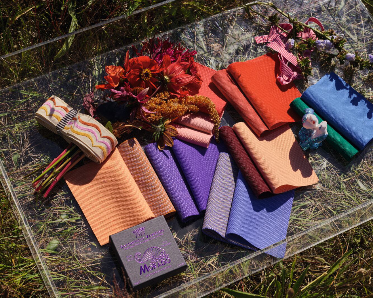
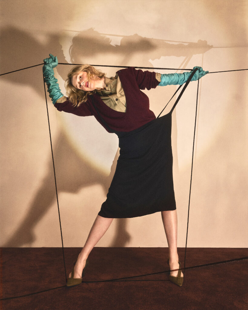
Here: Image courtesy of Kvadrat.
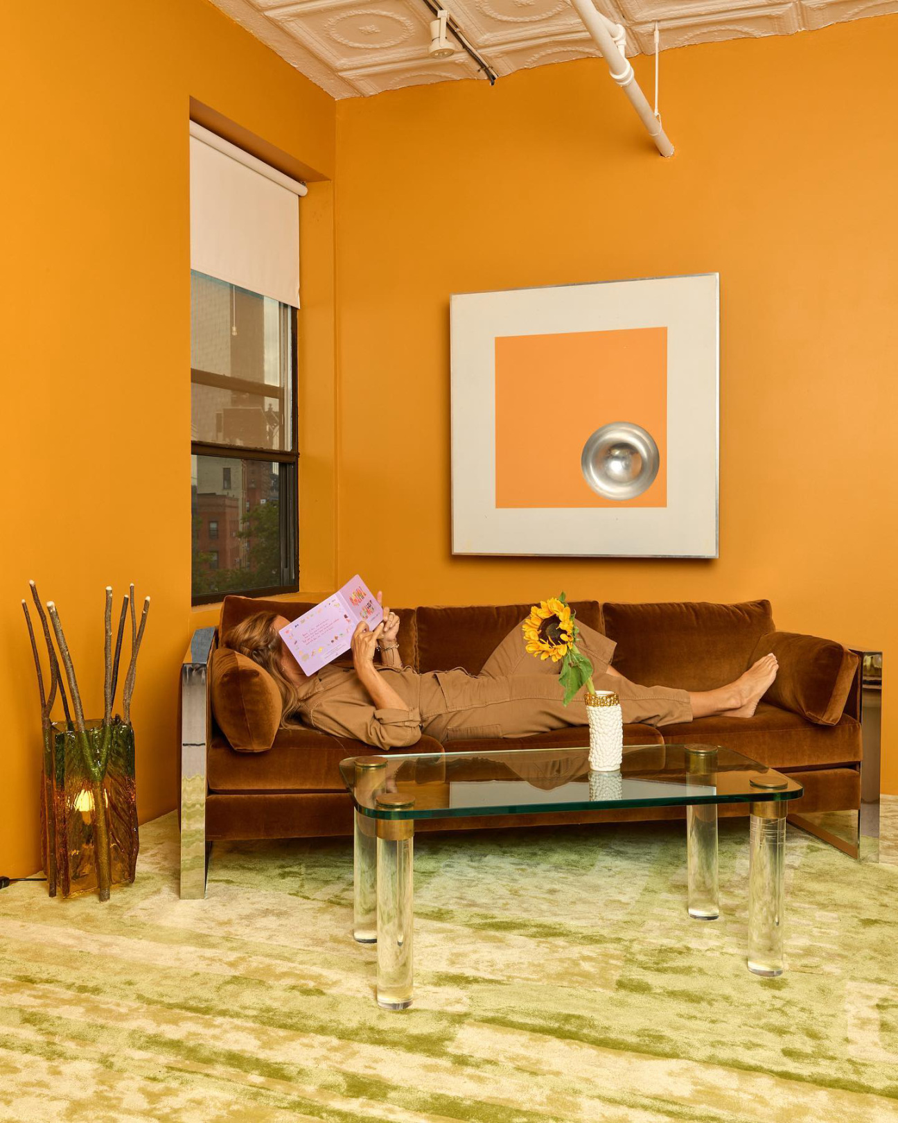
And yet within that framework, there’s also a growing desire to escape and transform interiors into retreats with expressive forms, eclectic patterns, and playful colorways that tap into cultural, historical, and natural references. Backdrop's new Barragan-Cito product speaks for itself in this regard. Developed with New York studio Coming Soon, the striking warm yellow paint alludes to the famous Mexican architect’s mastery of color when defining the different surfaces of his volumetric designs. Lately, inspiration is coming from almost everywhere and to impressive effect.
“The palette is inspired by my mother,” Giulio Ridolfo tells Cultured describing his recently-released Kvadrat Steelcut Quartet upholstery line. “It looks super natural with notes from our courtyard garden—dahlias, carnations, and cosmic blooms.” For his collection, Ridolfo created two dozen colorways informed by everything from the ancient buildings of Rome and the contemporary dance choreography of Anne Teresa De Keersmaeker to the vast landscapes of nordic countries.
Overall, design brands are putting out products that incorporate a more thoughtful range of tones inspired by recognized symbols, names, and places. Experts are taking a closer look at how the medium can transform architectural environments by evoking history and bringing nature inside. Finnish furniture manufacturer Artek’s recent collaboration with California tile producer Heath was many things and not in the least a strong demonstration of color research. Cladding classic Alvar Aalto tables and stools, ceramic plates normally destined for bathroom or kitchen fit-outs are cast in earthy greens and off-white creams derived from lush forest settings. Referential color is making its way through other areas of design but with too many examples to mention here.


 in your life?