Hans Ulrich Obrist: How did you come to art? Did you have an epiphany or a sudden awakening?
Jennifer Packer: It was seeing Caravaggio’s Saint Matthew series (1599– 1602) in the Contarelli Chapel at San Luigi dei Francesi in Rome that I recognize as the moment I became a painter. Caravaggio made me understand what a painting could do.
I felt connected to his deep, dark representation that seemed almost blasphemous and also seemed to contradict all the other optimistic images that were in the church and in the city. There’s this break between the entropy you feel in the city and the beauty of the images presented. If you go from church to church you see incessant glorification. Suffering isn’t depicted as painful, like in works by Ribera or Mexican religious painting. It’s more superficial or circumstantial. Even if you go to the Sistine Chapel and see Michelangelo’s Last Judgment (1536-41), people are literally going to hell and it doesn’t look so bad. Caravaggio’s work was so much truer than any other images that I’d seen; it felt human. He was able to synthesize all the information and images from artists who seemed to be real believers. He’s able to use Giotto. He’s able to use Michelangelo and make it nasty. Sometimes when you look at these paintings in churches you forget that electricity hadn’t been discovered and wouldn’t be understood for another 200 years, so there’s this fabrication of lighting conditions in paintings that you see everywhere in Rome, as if everywhere is flushed with an ever-present light. In Caravaggio’s painting The Calling of Saint Matthew (1600), Christ is completely in shadow. He’s walked into this tavern and he’s pointing to Saint Matthew, but you can barely see him. I feel this is closer to what you’d read in the New Testament, where Christ isn’t purely radiant and flowing. There’s pain and he suffers in darkness. There’s also something of this pain in Caravaggio’s paintings The Conversion of Saint Paul and The Crucifixion of Saint Peter (both 1601) in the Cerasi Chapel in Santa Maria del Popolo. You only see it from someone who’s endeavoring to capture humanness, which I don’t think a lot of Italian painters of this time were trying to do. They were capturing a fantasy, a world of people who are larger than life, where religion and its stories were a myth, whereas Caravaggio is treating it like this could be happening today. There’s something so deeply sad about those works, and I felt recognized in them.
HUB: I’m interested in how you begin a painting. Lynette Yiadom-Boakye has said that within your work there are “infinite possibilities of color, space, composition and, ultimately, life” and that you are “a painter who always makes you want to keep looking and learning. A painter who makes you feel excited about the act of painting.” How do you start, given these infinite possibilities? Is it with a sketch or a photograph or with a dream?
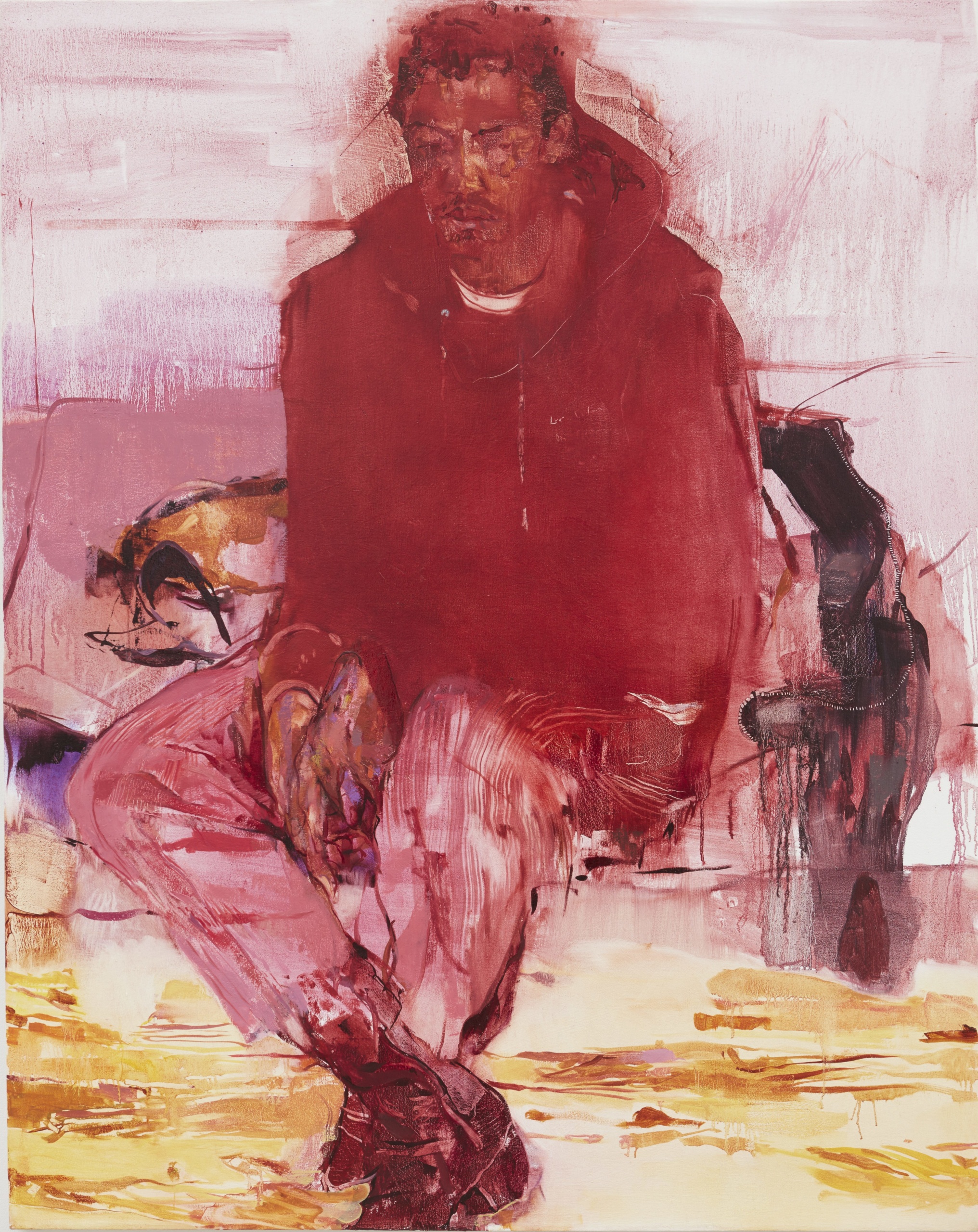
JP: I think I approach painting through questions of hierarchy, beginning with what’s of the deepest significance. Historically, light is value, so something that’s given value is blessed with radiance. That’s a function of how color operates. I usually want light to be in, through and with everything, for everything to be abundant with light. I’m interested in responsibility or accountability in a picture, but one thing in relation to the next, so that nothing is more or less important than another. Matisse wrote about this, how essentially expression and harmony, or expression and wholeness, were inextricably tied, so that anything that doesn’t belong in the painting is not there. So I usually approach a painting that way, thinking about what’s essential to the image and to the feeling within my own expression. For observational portraiture, I ask someone if they’d like to sit, or if they just happen to be in the studio I might ask them if they’d mind if I paint them. So things tend to seem a little more obvious when producing an image like that. Everything is there, and everything is true, so it’s irrefutable in the painting. Drawings are made from memory, from something I’ve seen in the world, or occasionally they’re based on photography. The interiors and the bouquets have become composites of observation. I don’t usually use the word “intuitive,” but I feel like I flow between moments of observation and imagination.
HUB: In some sense, your work is autobiographical?
JP: Of course. What else can we do? I like the idea that I’m the only one who can make a certain painting, and I tend to want to push that, whether it’s technically, conceptually or emotionally. What I also like about painting is, if I say a word, I can make an image that pertains to that word, and that’s my ideal version. I can paint anything and see anything I’d like to see, even things that I’m not sure I want to see. I saw Titian’s The Flaying of Marsyas (c. 1570-1576) when I was in Rome, where he’s strung upside down, and I was thinking about Titian painting this body and deciding how much care to give to Marsyas. I feel the same way: the idea of painting as an exercise in tenderness.
HUB: You’ve said that the subjects of your work aren’t bodies but humans.
JP: I feel a resistance to the use of the word “bodies” to describe the figures in my work. There’s an important difference between having a body and being a body. Bodies can be almost anything and are often subject to mindless objectification or a loss of humanity. I’m usually thinking about the significance of that distinction as I work.
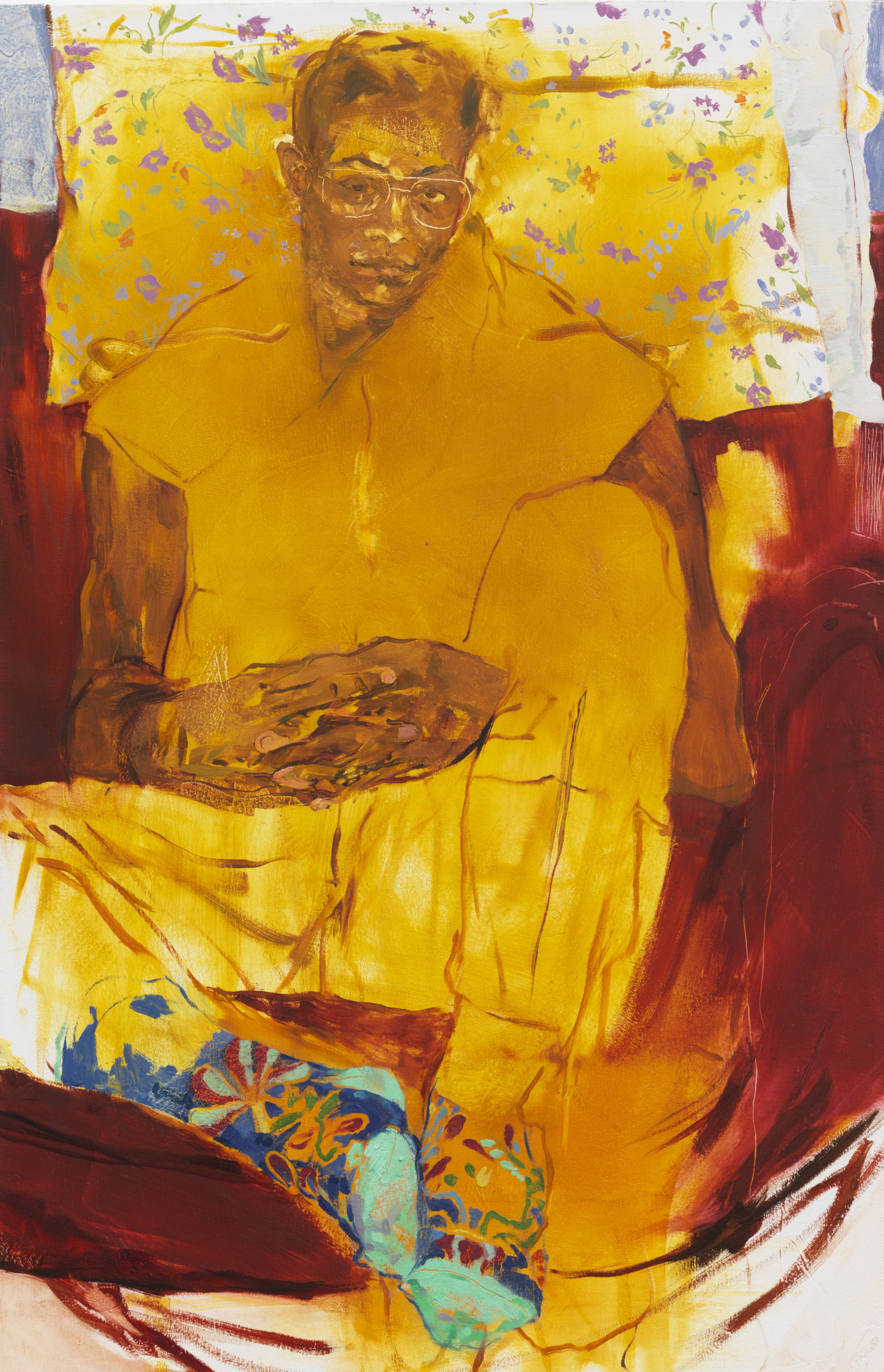
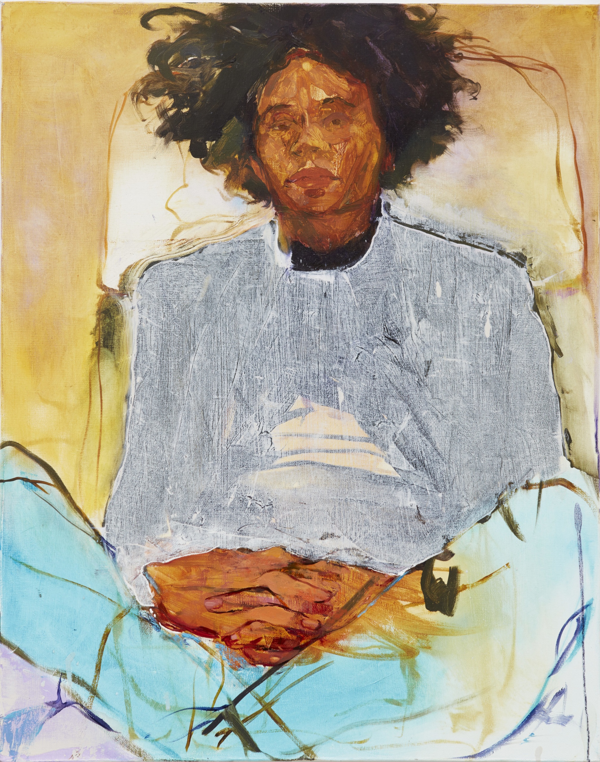
HUB: Very often, there’s a dominant color in your paintings. Yellow, for instance, reoccurs in your work, which is then rendered in many different tones and ways. Can you talk about how you approach color?
JP: Many of my questions when working have to do with “What’s the climate? Where’s the heat in the painting?” or, “Is there heat, or is there just color after color after color?” I’m trying to create this environment in which the figure exists, so the climate is really important, as much as a mood, or as much as a sense of newness, which is how people often utilize color. I think a lot about Milton Avery, who made paintings that sometimes feel so timeless just because of the way that the colors sit and radiate. A lot of my paintings around 2015, such as Vision Impaired, were monochromatic because I was giving equal importance to negative space and the adornment of the environment. I thought, “What’s the significance of the difference between a person and a chair, in terms of social or cultural value?” Manet got a lot of crap for painting a person the same way as a parrot or a guitar. There’s no hierarchy. I started to use the monochrome as a way to force any distinctions that were necessary to happen through tactility, through the amount of color on the surface, rather than these other arbitrary shifts. I could then eliminate things that were inessential pretty quickly. You could feel something was there because it was dense, but what difference does a light casting a shadow do for some of the paintings I’ve made? The monochrome became a severe editing process. It was a way of being critical about making very tight pictures with considered surfaces. Can you make a good painting with one color?
HUB: What role does drawing play in that? When I was in your Bronx studio last year, what really struck me were your large-scale charcoal drawings.
JP: There was a time when it felt like drawing was in the way. I couldn’t paint to save my life. So, I would draw an image and the drawing would feel so complete that the idea was already realized. It would prevent the painting from ever occurring. So I stopped drawing so that I could actually focus on painting. It’s still true that the drawing removes possibility, but it makes the paintings more pointed. Drawing doesn’t just translate into painting effortlessly. For me, drawing is almost like a primary language: you can start scribbling before you put sentences together. It’s really direct; it’s easier to approach an image through drawing. When I began making small paintings, it was to spite people who said that small paintings were studies, even though there are many examples of stunning small works, by van Eyck for instance, that are not. But then I started to think of drawing as this thing that could do something unique and immediate that painting would have to work so hard to achieve. I wanted to challenge myself to approach drawing in such a way that it could argue with a painting. Typically, my drawings aren’t images that become paintings. They’re like this counter-practice. Even if it’s the same image, I see them as being completely different. Our exhibition is going to be one of the first times where I’m really emphasizing that relationship.
HUB: I was wondering to what extent you feel politics enter your painting?
JP: I feel a kind of responsibility. Painting can go where photography cannot. I think my task as an artist is to be more attentive. Everyone should be attentive, but I ask myself to look and reap the benefits and witness pain with that consciousness. I think it’s impossible not to talk about politics, even in the most casual way. I’m thinking about Black representation in portraiture. I’m thinking about walking through the Met and looking at the Rubens, or any other large paintings of that nature, which are about a decadence that was funded through procuring riches from other parts of the world in questionable ways.
HUB: You mean the painting of the colonial age?
JP: Yes, of course. I feel a responsibility for things that I haven’t even fully named yet. I was thinking about the exhibition “Posing Modernity: The Black Model from Manet and Matisse to Today.” Maybe 50 to 60 percent of works in it I’d never seen before and it was contextualized through the politics of the day. The fact that Black women were relevant and had meaningful social status is otherwise completely unclear within the context of French painting without shows like that. You are highly unlikely to learn this fact from any major museum collection. In 1794, France abolished slavery, then reestablished it six years later. French institutions changed the names of painting titles so you wouldn’t have known that the models were actually Black, or that their titles read as offensive today. Institutions, through their insistence on master narratives, neglect or intentionally withhold essential representations or counternarratives that would help us better understand history and the impact of BIPOC folks. These gestures seem to benefit those who are invested in ideas of their own innocence or who suffer under scrutiny or transparency. Institutions also tend to distinguish, hierarchically, artifacts from art in ways that are extremely problematic, especially when many of those “artifacts” have been acquired through colonization or other culturally destructive or transformative acts. The artifact becomes a shadow to the more significant narrative of art history. The fact that there are so few representations of Black women in the Met at all proves this resistance or fear of acknowledging the importance or centrality of Black women to the success of the colonies and European interests in general.
HUB: Some of your earlier paintings, especially the monochromes of figures in an interior, verge on the abstract. There are many different forms of abstraction—formalist, political, social. What’s your relationship to this, and how does this figuration-abstraction oscillation occur?
JP: People think representation is more believable or real than abstraction. But van Gogh’s paintings don’t look real. I’ve never seen a painting that looked real, but I’ve seen paintings that felt real. I’m interested in something that runs through the work despite what the image is. Morandi, Cézanne and Fantin- Latour do this for me. It’s something happening that builds the picture into what it is, but it isn’t reliant on the picture itself. I think de Kooning is one of those artists too. In my second year of painting, I was heavily invested in abstraction. I was really into Mark Rothko, Clyfford Still and Barnett Newman. I was completely blown away when I saw Newman’s Stations of the Cross in DC. It impacted the way that I thought about space and being enveloped in a painting. At Tate Modern, the Rothko room is insanely intense. Early on, I made some faux abstract paintings. They’re mostly representational derivations that were over-reductions. I’m really interested in Greenberg and modernism, and this idea that all that matters, all that’s true, is the material. You have the surface and everything emerges from it, as if everything is just a low-relief sculpture. In the past, artists were trying to get all the brush marks out of their representational paintings. But it’s still a low relief sculpture that happens to be a picture. So I usually use the word “dissolution” to describe what others might call abstraction. I’m interested in the breakdown of something that pretends to be something else: the representation of the simulation.
This extract is taken from an interview first published in Jennifer Packer: The Eye Is Not Satisfied With Seeing, (Eds. Melissa Blanchflower and Natalia Grabowska) to accompany the artist’s exhibition at Serpentine, London (19 May – 22 August 2021) which tours to Whitney Museum of American Art (29 October 2021 – 17 April 2022).
Craving more culture? Sign up to receive the Cultured newsletter, a biweekly guide to what’s new and what’s next in art, architecture, design and more.


 in your life?