My mother has always had a soft spot for Liberty of London, one that I inherited like a blood type. I guess I have always been able to see the charm that for my mother, a former fashion designer, starts with the fanfic archive, which still occupies the rafter-striped top floor of this beloved department store. It is perhaps this name brand bias for Liberty of London’s idiosyncratic twee effect coupled with a desperate desire to find the right shade of medicinal pink for a new half bathroom that initially led me towards the centuries old fabric purveyor’s recent collaboration with paint company Farrow and Ball. But what kept me around was the interesting dialogue it spurred between two heritage manufacturers who together have outfitted interiors for more than 100 years. As stalwarts in their respective fields, both Farrow and Ball and Liberty embrace a quality over quantity approach that doesn’t lend itself to new collections or outputs, so this collaboration—unlike other design overlaps—didn’t produce any new colorways or materials. Rather, it focused its attentions on reviving the genius of existing inventions through the thoughtful juxtaposition of archival materials.
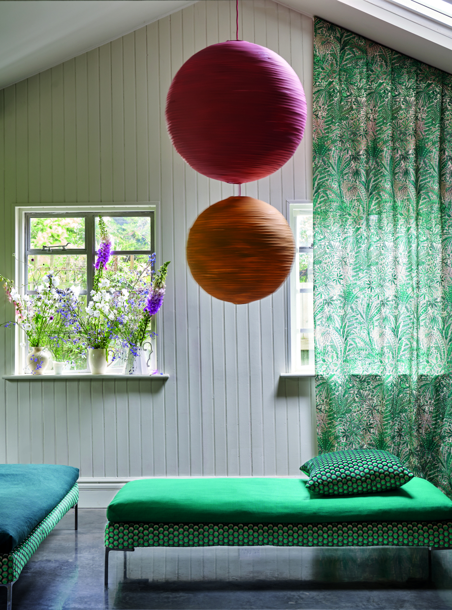
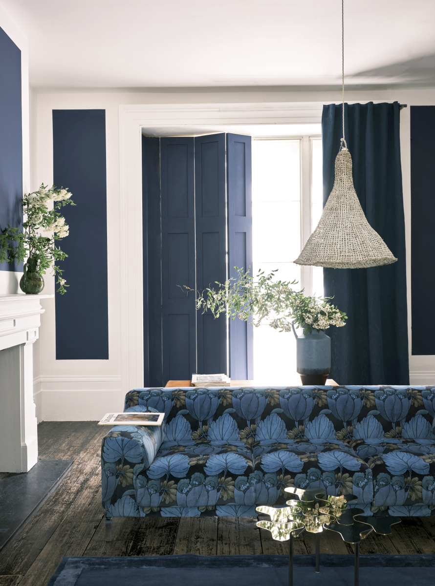
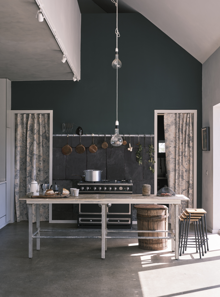
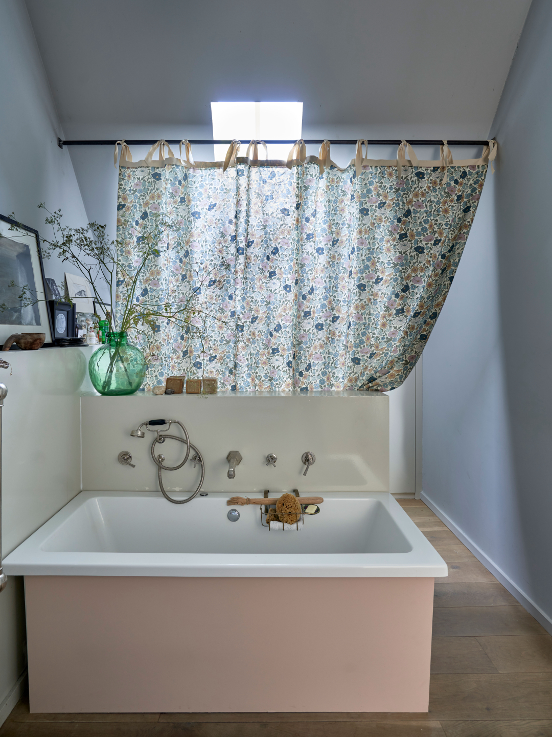
This business-on-business project pairs not-often-seen paints from the Farrow and Ball vault with fabrics from Liberty that tease out historical connections in shades and motifs. For instance, the collection revives Berrington Blue, a black-based navy taken from Herefordshire's Berrington Hall, and the earthy green tone of Olive, another early color for Farrow and Ball. I landed on a messy pink dubbed Potted Shrimp thanks to a suggestion of a peaceful bathroom outfitted with the flower calamity that is Liberty’s Poppy Meadowfield alongside Farrow and Ball’s Lichen and the aforementioned pink hue for the tub. This rosy shade was not something I’d ever considered when shopping the ombre strips at the hardware store. But in the end, it was the perfect solution for a gallery-wall style I had for that space and all my floral prints. Pink is apparently as timeless as becoming your mother. Don’t worry; in the end, it looks even fresher than you’d imagine.


 in your life?